
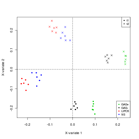
sPLS-DA analysis for 2 factors
We arbitrarily selected 200 variables per dimension, but a more objective tuning would involve using the tune.multilevel.R function (here).
For illustrative purposes, we artificially created a second factor in the data, indicating the time of the assay.
## this is an artificial second factor
time <- factor(rep(c(rep('t1', 6), rep('t2', 6)), 4))

## to ensure the labels are the same in stimu.time and pheatmap
stimu.time <- data.frame(cbind(as.character(stimulation), as.character(time)))
repeat.simu2 <- rep(c(1:6),8 )

result.2level <- multilevel(X.simu,
                         cond = stimu.time,
                         sample=repeat.simu2,
                         ncomp=2,
                         keepX=c(200, 200),
                         tab.prob.gene=NULL,
                         method = 'splsda')

## color for plotIndiv
col.stimu <- as.numeric(stimulation)

## pch for plots
pch.time <- rep(20, 48)
pch.time[time == 't2'] <- 4

plotIndiv(result.2level, col = col.stimu, pch = pch.time, ind.names = FALSE)
legend('bottomright', col = unique(col.stimu),
       legend = levels(stimulation), pch = 20, cex = 0.8)
legend('topright', col = 'black', legend = levels(time),
       pch = unique(pch.time), cex = 0.8)
The individual plots look like:
Next we prepare the pheatmap chart:
#color for heatmap
# there are 6 samples
col.sample <- c("lightgreen", "red","lightblue","darkorange","purple","maroon")
col.time <- c("pink","lightblue1")

# there are 4 stimulations
col.stimu <- c('green', 'black', 'red', 'blue')
label.stimu <- unique(stimulation)
label.time <- unique(time)

pheatmap.multilevel(res.2level,
              col_sample = col.sample,
              col_stimulation = col.stimu,
              col_time = col.time,
              label_color_stimulation = label.stimu,
              label_color_time = label.time,
              label_annotation = NULL,
              border = FALSE,
              clustering_method = "ward",
              show_colnames = FALSE,
              show_rownames = TRUE,
              fontsize_row = 2)
And the resulting chart for 2 factor analysis:
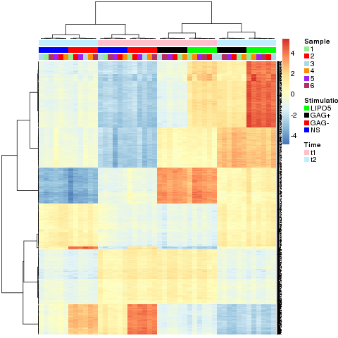
This time there are three levels at the top of the heatmap. The first level (light-blue and pink) denotes the time factor, the second level (blue/red and black/green) the stimulation factor and the third level the repeated measurements on the samples.